
It’s easy to misjudge what style of design needs to be included in work when you’re new to the game. Often, simple bad choices can affect the quality of work and thus have a knock-on effect damaging confidence. We’ve all been new to something and making mistakes only helps your work progress.
Typefaces
It can be tempting to use all your favourite fonts in your latest design. With type, less is more! The general rule of thumb is no more than *maximum* 3, preferably 2. Keeping one type can help push branding and helps to maintain a professional look.
When designing branding, remember that type can directly influence how recognisable the brand is. Improve on white space, leaving ‘breathing’ room to bring focus on areas and the information easier to digest.
Our previous article on type goes further into detail and can help with a successful design.
Stock Imagery
With access to the internet, we have an abundance of free imagery to use. A common mistake amongst new graphic designers is, using assets that are copyrighted. When you use google imagery as a tool, you’re always at risk of landing yourself a fine.
Access copyright-free websites such as Unsplash or Pexels. Not only are these sites loaded with free imagery, but there is also a sense of the personality behind them. Also, anybody can upload their images onto these websites, meaning you get organic content rather than over-posed shots.
Scaling
Scaling can come with its own set of problems. When done correctly, you maintain the quality, shape and size with no distortion. When done incorrectly, you lower the quality and make the image narrow. Not only does this look unprofessional, but also makes the work look cheap.
To fix this, use the drag options on the corner of your image. On photoshop, it is designed to keep it scaled and will maintain the full image just on a larger or smaller scale. Other platforms have their methods (i.e InDesign you have to press shift + drag) so it’s always worth googling before scaling to ensure you do it correctly.
Hierarchy
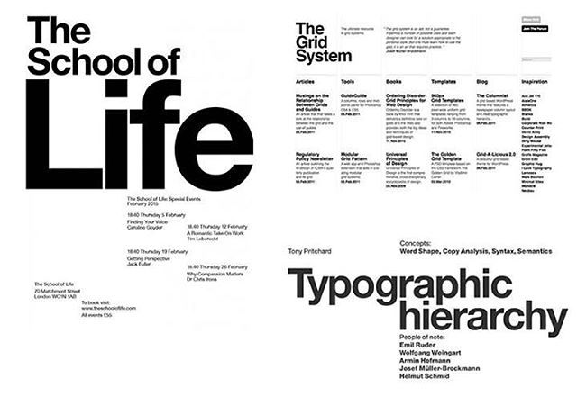
Sourced From: ‘Deandi Agency‘
When executed badly, information is lost. Simple tips such as making important information bolder and larger is a good use of hierarchy. Bad scaling can make it hard to distinguish elements and can confuse the user.
Good use of hierarchy can use a visual (such as a logo or a relevant image) larger than the text or place in a complimentary spot on the page. For secondary titles or information, use a smaller text than the headline. This will help the user to understand where the main title is and can help to outline purpose.
Organisation

Sourced From: ‘Koncept’
A messy piece of work is not only frustrating to look at but can be difficult to understand. Having a confusing layout can put users off looking at the imagery or information. Try neatly organising elements together, using white space around and between to help even the design and make it look ‘clean’.
Educating yourself about design can take time. Being one of many new graphic designers is all about the process and learning with time. Following tips from experienced graphic designers and user experience designers can help push your work forward and make for better design work.
Stay up-to-date with our articles that outline various topics on how to improve your work.