
In our articles, we discuss the importance of a mobile responsive website a lot. Websites which aren’t mobile optimised will likely have a much higher bounce rate compared to those that do. This means that numerous businesses out there with dated websites are losing customers by the day.
In this article, we will help you to understand how you can perform a mobile responsive test on your website. As testing is one of the most important parts before making your website public for the world to see, you must use some of the following tools which are available online.
Use Developer Tools on Your Browser
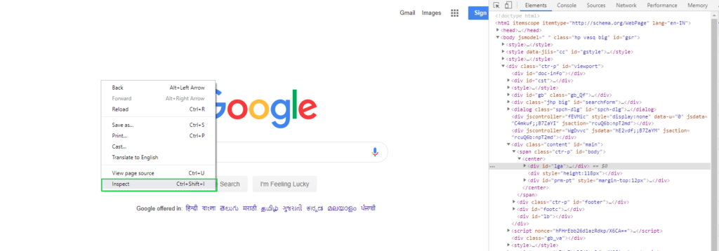
The easiest and quickest way you can perform a mobile responsive test is by using the ‘Inspect Element’ tool available on almost every browser (Safari, Google Chrome, Firefox, etc.). All you need to do is right-click on the web page which you would like to test and then click the ‘Inspect Element’ option from the settings.
Once you click this a whole new array of settings options will appear either on the bottom of the side of your screen. All you need to do is move your mouse to the top and click on the responsive mode dropdown. Then, you will be given several devices to choose from – with various screen sizes and resolutions.
The options vary from iPhones and Samsung devices to multiple tablet resolutions to choose from. Once you select one, you will instantly see how your website looks on the selected device. From here, you can go through your pages and take notes on any errors or possible user experience improvements.
Google Search Console
One of the more reliable and relevant tools out there, Google Search Console has numerous ways in which you can find any possible errors within your responsive web layout. Google Search Console will notify you of any critical site errors and allows you to manage them all in one place.
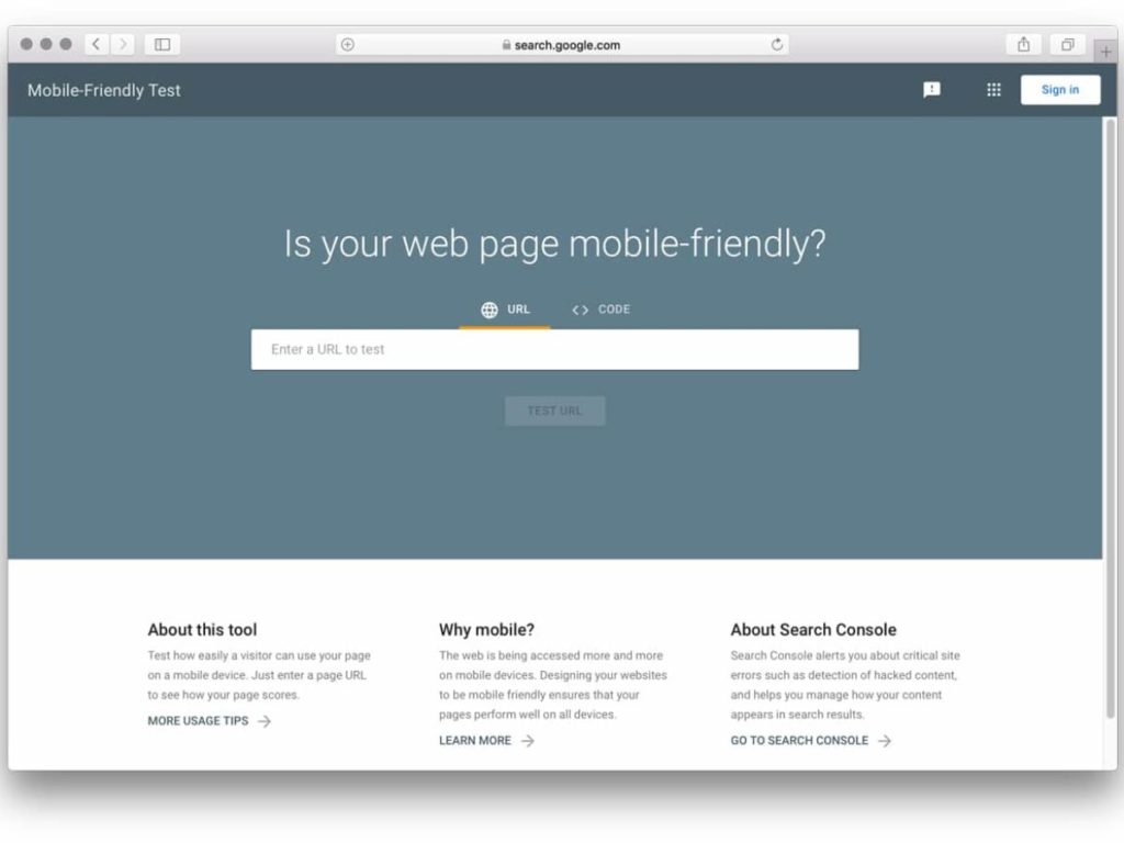
A tool we use every day here at Be My Social, it is extremely easy to use for a completely responsive site test. When you visit Google Search Console’s Mobile Test page, you are given the option to enter either the URL of the live site or the HTML code of the page that you want to check if in development still.
Once submitted, Google Search Console will check through and give you back a report on how well your website is on mobile devices. If all is well, you will see a green mobile phone icon on the left of the results with the text “Page is mobile-friendly”. Otherwise, Google Search Console will tell you what fixes must take place.
BrowserStack
Founded in 2011, BrowserStack is a well-known resource for many responsive web developers. Their platform provides users with over 2,000 devices on which they can perform a mobile responsive test. You can sign up for free or they have the option for more additional packages with more to offer.
On their interface, users can select from a large amount of different mobile devices, all of which you can test your website. This tool basically replicates what your website would look like along with functions and designs live on your desktop.
BrowserStack also informs its users of what are the most popular devices currently, allowing web developers to prioritise certain mobile devices over other less popular options. This way they can cater to most of their target audience rather than the minority.
In Conclusion
The ways in which developers can perform a responsive design test are countless. It always helps to use multiple options at your disposal, as other tools might pick up on something new on another device.
Keep testing your old pages in order to keep them current and relevant with changes in mobile screen resolutions. It will help you to stay in Google’s good books for many years to come.
If you would like to know what we believe are some of the most important tips for great mobile responsive design, have a read through our article here.
If you would like to improve your website’s mobile responsive design, get in touch with our team today! Based in Doncaster, we provide marketing services across the UK at bespoke prices.