
The majority of brands have a palette in mind. The first move when applying colour to design work is to choose which is more predominant within the branding. This is the one that will be repeated and recognised in correlation with the brand, helping to maintain consistency and maximise the final designs.
Whether you’re vector-based, focus on web creation, visual identity, content creator for social media or use drawing tools – choosing a great collection is important to all designers.
Applying the Basic Rule
Adding colour to design work can make or break the outcome. During your process, it’s always important to choose which is prefered as the dominant hue. This is where the basic rule of 60-30-10 comes into play.
Choosing the second colour within a palette should always focus on being within 30% of the design. Helping to maintain good consistency, choose a second version that fits well with the dominant colour. The final 10% should be a nice, complimentary one which will then help smoothly accentuate areas.
A really easy way to pick a palette is to head over onto the creative cloud app ‘Adobe Illustrator’.
Simple Illustrator Hack
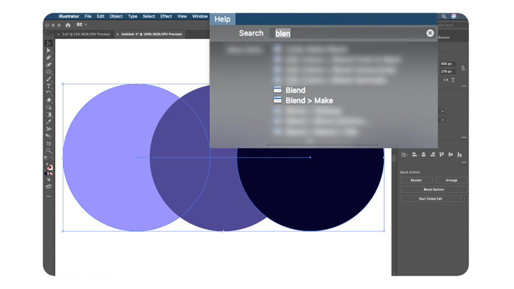
To create your personalised palette (or multiple variations to compare hues), follow the below steps:
- Create 2 shapes with the two colours you want
- Double click ‘Blend Tool’ and choose the spacing
- Click the start and then the end shape
- Then using ‘Object > Expand Appearances’ choice, you can alter the colour and experiment with variations
When using the hack, it’s a good idea to do multiple variants and place them below one another. This will help create a clear outline of which fit together.
Use Psychology
Scientifically proven to change emotion – colour psychology is important. Used correctly, it can give a better user experience and help portray what is going to be expressed by the design. Below is a list of colours and their typical perceived emotion to help you begin the process of understanding the psychology:
Red – energy, attention, anger, passion
Orange – creative, fun, independent
Yellow – positive, enthusiastic, happy
Green – kindness, envy, growth
Blue – wisdom, freedom, emotional
Pink – immature, playful, love
Purple – mysterious, spiritual, sensitive
Black – Power, discipline, elegance, modern
Valuable Resources
There are many ways to approach colour and using the above process will help reduce the risk of unsuccessful choices. Now we all have access to the internet, we can utilise sources and help push our idea generation and knowledge further. Handy websites have been created and are an easy, successful way to get instant colour collections.
www.coolors.co – www.paletton.com – www.colorbox.io
At Be My Social, we can take the weight off by created designs for you. Contact us for a bespoke price and to discuss how we can help to maximise your brand!