
Freelance designers who personalise proposals and bid strategically win up to 60% more projects on platforms like Upwork, yet many still rely on generic copy-paste bids that get ignored. What if a few smart tweaks could turn your bids from overlooked to irresistible?
Key Areas We Will Cover:
- Understanding the bidding landscape for designers in 2026
- Researching projects and clients before bidding
- Crafting personalised, standout proposals
- Pricing strategies that win without undervaluing your work
- Showcasing your portfolio and value effectively
- Common mistakes to avoid and pro tips for higher success rates
Introduction:
Bidding as a freelance designer requires more than talent; it demands strategy to stand out in competitive marketplaces. With platforms evolving and clients seeking proven value, mastering simple yet effective bidding tips helps designers secure better projects, command fair rates, and build sustainable careers. This guide shares practical advice to improve your win rate, from research to proposal writing and pricing in 2026.
The Freelance Designer Bidding Landscape in 2026
Platforms prioritise quality over quantity. Clients favour proposals that demonstrate understanding, relevant experience, and clear value. Key shifts include AI-assisted tools for faster research, boosted visibility options, and emphasis on authenticity amid rising competition from global talent.
Tip 1: Research Thoroughly Before Placing Any Bid
Never bid blindly. Invest time upfront to boost your chances.
- Read the full project description multiple times to grasp requirements, goals, and pain points
- Review the client’s profile, past projects, website, and industry for context
- Check competitors’ similar work and average bid ranges (where available)
- Assess feasibility: do you have the skills, time, and resources to deliver excellently?
This preparation lets you tailor your bid and spot poor-fit jobs early.
Tip 2: Personalise Every Proposal
Generic bids lose; custom ones win.
- Address the client by name and reference specific project details
- Explain how your skills solve their exact problem (e.g., “Your e-commerce site needs mobile-optimised visuals to reduce bounce rates; my recent Shopify redesigns achieved 40% faster load times”)
- Highlight 2 to 3 relevant portfolio pieces with brief results
- Keep it concise: 4 to 6 paragraphs maximum, focused on the benefits to them
Show enthusiasm and professionalism without overpromising.

Tip 3: Price Strategically and Justify Your Value
Avoid racing to the bottom; bid what reflects your expertise.
- Calculate based on time, complexity, revisions, and your hourly rate (factor in 2026 market averages for designers)
- Offer tiered options if suitable (basic, standard, premium packages)
- Explain pricing briefly: “This £800 fee covers custom concepts, three revisions, and source files, ensuring a polished result aligned with your brand”
- Consider value-based pricing for high-impact work rather than hourly
Clients pay for outcomes, not just effort.
Tip 4: Leverage Your Portfolio and Proof Effectively
Visual proof builds trust instantly.
- Link directly to 2 to 3 most relevant examples
- Include short captions with metrics (e.g., “Increased client engagement by 35%”)
- Attach mockups or quick concepts only if the platform allows and it adds value (avoid free full work)
- Mention testimonials or repeat clients for credibility
A strong portfolio turns bids into conversations.

Tip 5: Avoid Common Bidding Pitfalls
Steer clear of these frequent errors.
- Bidding too low, signalling low quality
- Offering unlimited revisions or free extras upfront
- Using templates without customisation
- Bidding on every job instead of selective, high-fit ones
- Ignoring platform features like boosts or alerts for better visibility
Pro Tips for 2026 Success
- Bid early on fresh postings for higher visibility
- Use platform tools (e.g., job alerts, proposal boosts) wisely
- Follow up politely if no response after a week
- Track your bid-to-win ratio and refine based on data
- Build a personal brand outside platforms for direct clients over time
How BeMySocial Can Help Freelancers and Designers
While we specialise in full digital marketing for businesses, our expertise in content strategy, social media, and branding helps designers craft compelling profiles, proposals, and portfolios that attract premium clients. We also support agencies and freelancers scaling their presence online.
Conclusion:
Effective bidding as a freelance designer combines research, personalisation, smart pricing, and value demonstration. Apply these simple tips consistently to increase wins, secure better rates, and grow your freelance business sustainably in 2026’s competitive landscape.
Get Started Today
Need help refining your designer profile, proposals, or overall online presence to win more bids? Contact BeMySocial for tailored digital marketing support that elevates freelancers and creative professionals. Call us on 03305 519 900, email hello@bemysocial.com, or visit us at First Floor, 8 Priory Pl, Doncaster DN1 1BL, United Kingdom. Let’s boost your bidding success together.
Frequently Asked Questions
These address common concerns for freelance designers, improving their bidding approach in 2026.


A no-fuss attitude and a speedy turnaround!


I’ve found the to be the very best company for us after trying several others over the years.
I’m glad to have them, because the cost of hiring someone directly to do the same work would be impossible.
Highly recommended.


Ruth and Emily are amazing, they are always on hand to answer any questions and explain everything thoroughly.

Our contact Ruth always makes herself available for telephone/zoom meetings, constantly checks up on how sales are progressing and advises on changes to marketing strategies to try and ensure increased traffic to the website. I cannot recommend them highly enough 🙂

Social Media Design Trends 2026 for UK Service Businesses: Bold Typography and Grainy Textures Guide
In a crowded digital landscape, a striking social media post can stop the scroll and win a customer in seconds. Imagine your Yorkshire plumbing business post featuring bold, oversized typography

How AI Search Optimisation Helps Small Businesses in Yorkshire Appear in AI Answers 2026
Imagine a potential customer in Leeds or Sheffield asking, “best local plumber for emergency repairs near me,” and receiving an instant, tailored recommendation from ChatGPT or Google AI Overviews, without

Hyper Local SEO Strategies for Doncaster Businesses: Targeting Neighbourhoods Like Thorne and Mexborough
A local resident in Thorne searches “emergency locksmith near me” on their phone while locked out at 10pm. Will your Doncaster business appear in the results, or will a competitor

How to Use Google Business Profile and Local Citations for Locksmiths, Plumbers, Roofers and Electricians in Yorkshire to Gain More Customers
A homeowner in Sheffield faces a burst pipe at midnight or a resident in York needs an emergency locksmith after a break-in. In 2026, these urgent searches often start with
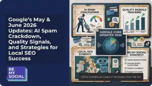
Google’s May & June 2026 Updates: AI Spam Crackdown, Quality Signals, and Strategies for Local SEO Success
A sudden drop in local search visibility for a Doncaster plumber or a Sheffield roofer this scenario played out for many Yorkshire businesses following Google’s May and June 2026 updates.
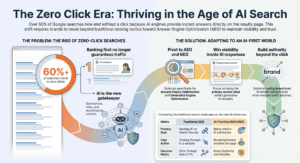
Why Ranking First Isn’t Enough: Optimising for AI Answers and Generative Engines
With more than 60 per cent of Google searches now ending without a single click to any website, even securing the top spot in traditional search results no longer guarantees