
A critical part of design is typography and typeface. When used incorrectly, typography can cost you a client or new design job, which is why it’s very important to know what typeface is right for the circumstance. You could use the best imagery and graphics in the world – but if your typeface screams ‘COMIC SANS’, you’re going to be in big trouble.
When we speak about typography, we’re not talking about picking a font. Plenty of factors can alter the effectiveness of a typeface deeming it to be ineffective and unbalanced. Elements should be evenly spread and arranged equally with blank space.
If you’ve ever spoken to a designer concerning the type, you’ll have noticed there are different terminologies used. These are Typography and Typeface.
– Typeface is used when referring to a family of fonts
– Typography is the way fonts are displayed
Elements of Typography
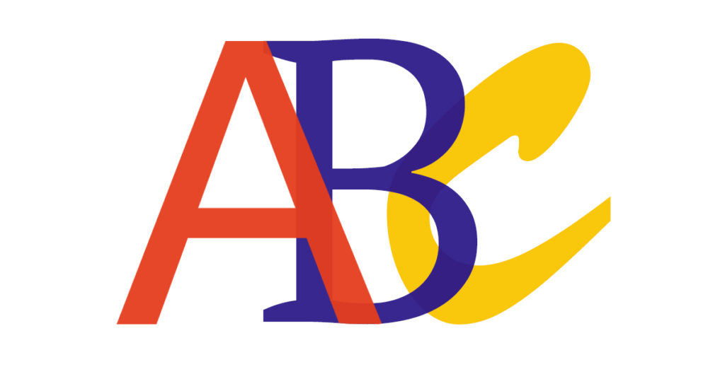
There are three basic typeface categories: Serif, Sans Serif and Decorative.
Serif refers to the embellishments on the font (names ‘serifs’)
Sans Serif refers to the lack of embellishments (‘sans’ means without)
Decorative refers to a type design that doesn’t follow the traditional structural categories
Pairing Serifs with Sans Serifs is a great way to approach differentiating title with body-of-text. Using decorative fonts sparingly will help keep professionalism and for your work to remain uncluttered.
Brand Identity
When developing a brand identity, it can be very difficult to make a choice of typeface. To choose, make sure you’re happy with the whole family as persistence is key when it comes to branding. The greatest part about typography is having the opportunity to express character and personality. Creating a logo doesn’t always have to contain typography, but if it does it can be a great way to show what type of brand you are.
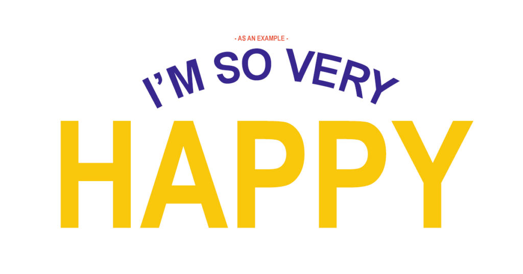
You can use multiple fonts within branding – but there are a few rules to keep it semi-consistent and professional. If you have a heavy statement font, it can be a great idea to combine it with a lighter sans serif. When using similar fonts, it can become cluttered. As an example, it’s probably best to avoid using two decorative fonts in one design.
Customer Experience
When somebody visits your website, see’s your advert, looks at your social media – they need to be captivated to stay. You have to ensure that you have an even weight of graphics and typography to keep a customer interested. The best part of typography is the personality you can show through type – meaning you don’t necessarily have to use an image to represent what you’re trying to get across.
Typography can convey emotion, so if you’re using it to represent a serious matter, it can be a great idea to use a simpler, more professional font family. Representing a game? Then taking concepts from the game as inspiration to accurately show the category as it can be an effective approach.
Content Importance
Sometimes you need to use type to show hierarchy. Typography can be an effective way to show what’s more important. You can ensure the content is viewed first by highlighting in a heavier version of the typeface and having it significantly larger in size and weight.
Repeating the same pattern throughout your typography helps to sustain harmony which is the leading factor for successful typeface design. This can create an artistic-yet-professional effect to your branding and provides continuity.
Recognition
We all recognise brands through their type. We see a Pepsi logo and we know its Pepsi. We’d also know if somebody has stolen the typography used by Pepsi through association. This is why it’s important to remain consistent and use a typeface with great variants that you’re happy with.
When building a brand, it’s crucial for you to have the consistency down and make it memorable so that people can recognise your branding when they see it a second, third, fourth time etc.
Colour
Colour is also very important. Hue, Saturation and Value. But what do they all mean?
– Hue refers to the shade of colour
– Saturation is how strong the colour is
– Value adds lightness or darkness
This is important to consider when pairing a background and type colour. Using each in a way that compliments, makes the typography easy to read. The easiest way to approach this is by selecting the colours and turning it to grey-scale. This will help you understand if the colours are functional and if not, you know to tweak accordingly.
Hopefully, this has helped you make the right decisions around typography and typeface. Remember when creating your typography or when using a typeface, to ask yourself the important questions; Am I being consistent? Is my typography readable?
Interested in Our Design Services?
Contact us today to discuss our services with us!