Website Design can make or break how you’re viewed by potential clients. Moving towards trends will help your website stand out and show your company is modern and refreshed.
Some argue that trends shouldn’t be followed due to how fast they come and go – but simple changes such as colour hues can drastically change the perspective of your branding.
Minimalism
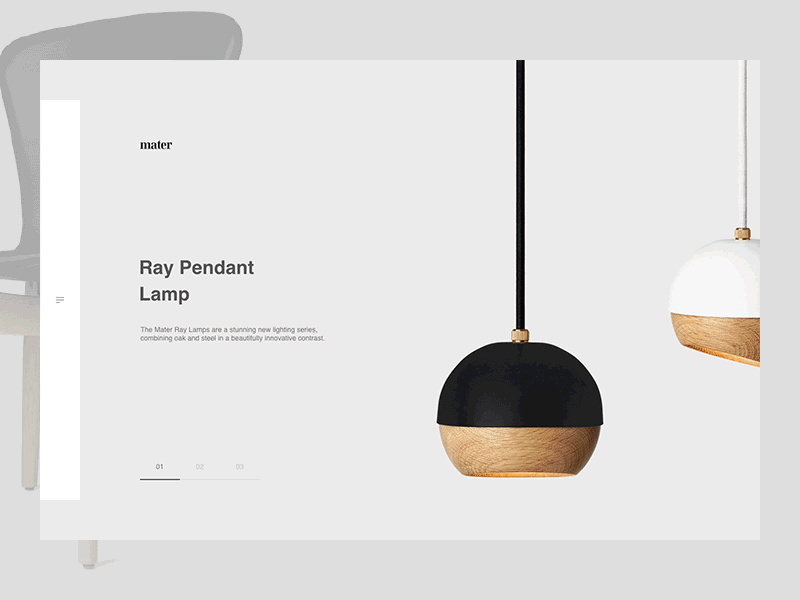
Websites don’t have to be over complicated. Minimalism within itself doesn’t necessarily mean bland or over-simplistic – but it does mean that less is more. During 2020, we’ve seen simplicity come back with a basic colour scheme and a timeless aesthetic.
To achieve a minimalistic website or landing page, consider maximising white space, keep your colour palette to a minimum and consider using 3 or fewer font types across the web page. Establish an illustrative style to use across your website to enhance consistency.
Smooth Shapes
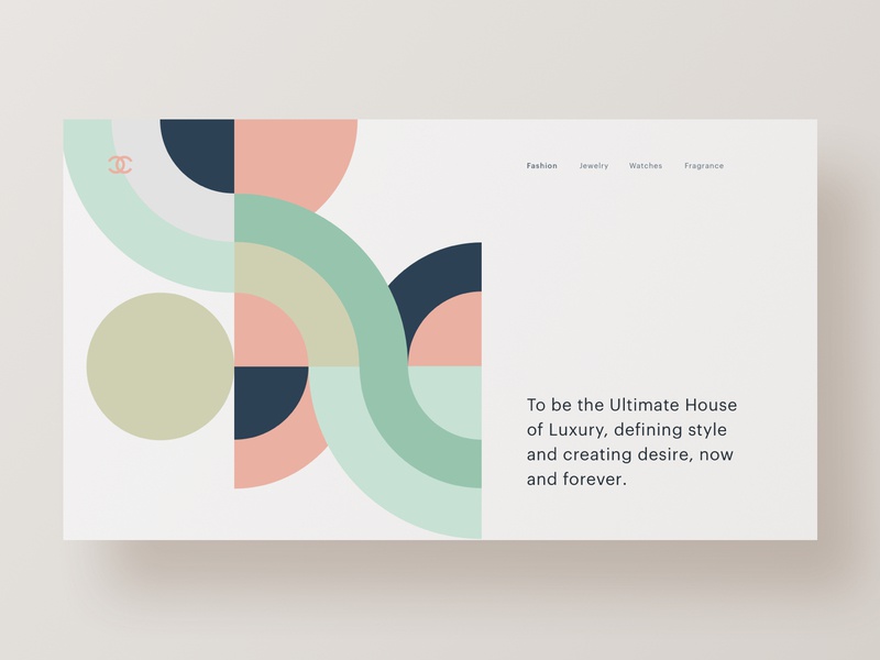
For those who’ve studied design, we’re all very used to sticking to the standard ‘grid’ that has dominated the design world for many years.
Adding smooth shapes and asymmetry to a web page can add depth and make certain areas stand out amongst the rest. Make your website feel ‘alive’ by adding shades to your shapes or variating the opacity! This keeps the users’ attention and makes it memorable.
Black and White
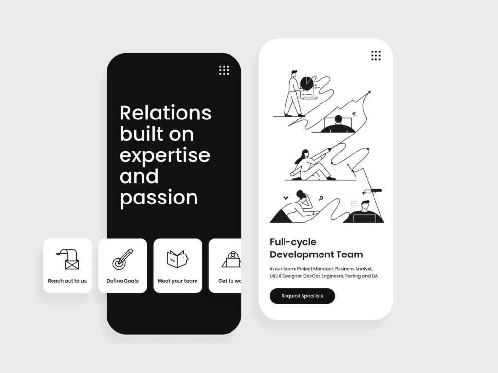
Colour dictates the mood and how a user can perceive your brand. Giving an audience a great visual experience has always been important for web development and this is often dictated by colour (alongside the many other important factors).
By using black and white web design trends, you won’t have to follow colour trends and it gives a great aesthetic. These tones are popular this year and have been well represented in popular branding companies and photography sites.
Stack Design
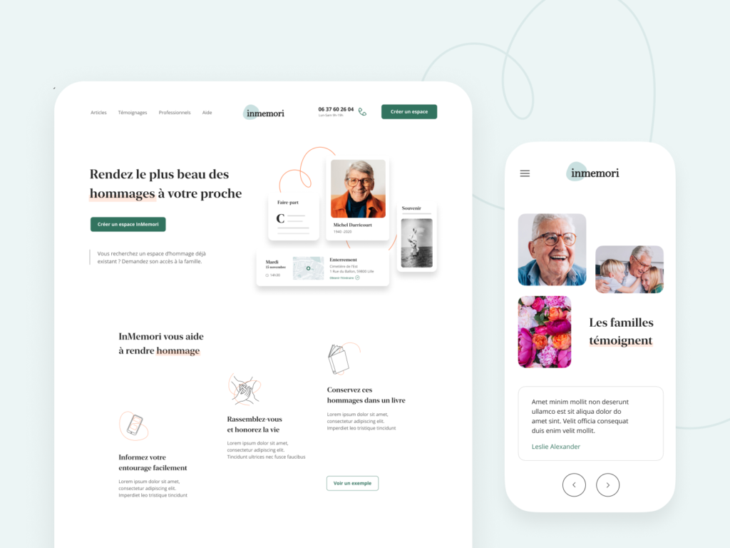
More than ever, we’re accessing web pages through mobile devices and smaller screens. Having a mobile-responsive website is crucial for a successful website, but it doesn’t have to be complex.
We’re seeing many designs featuring the classic stack affect universally used to fit any phone screen, on desktop view also. Facilitating complete navigation in one area is convenient and simple to use, making getting round your website much easier and simplifying the experience for the user.
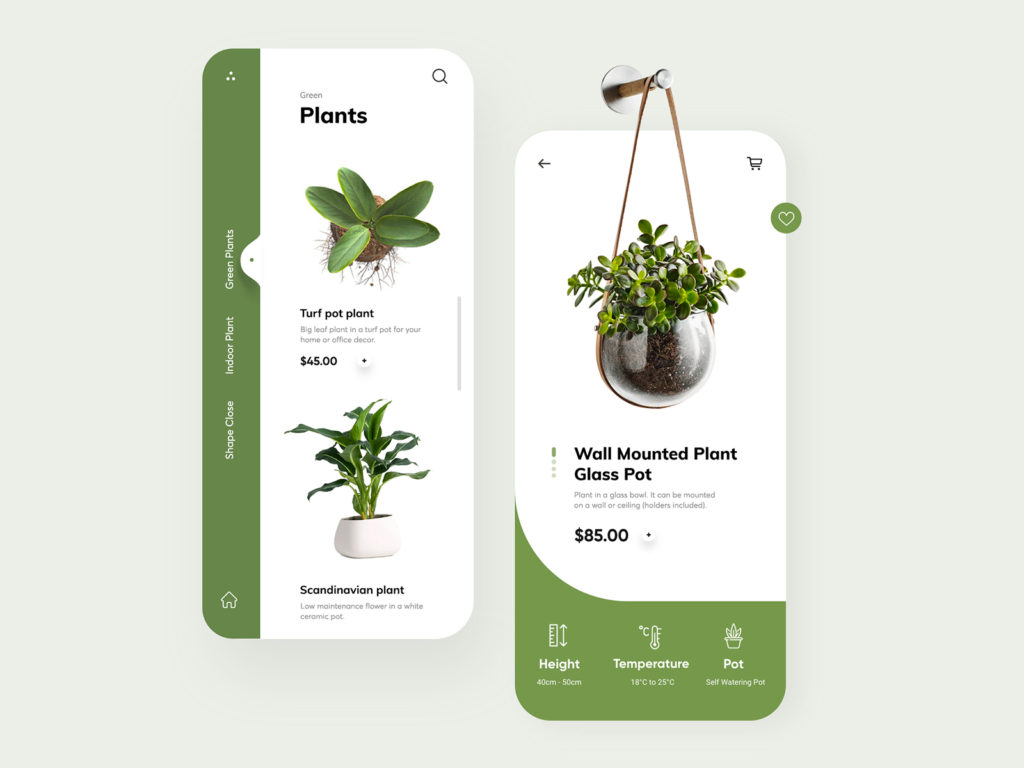
A website doesn’t have to follow trends or traditional grids and guidelines. Housing many shapes, fonts, colours, imagery and content can be displayed in many different ways and creating a site that reflects your brand or company is key to creating the best UX design you possibly can.
Stay on top of your website, make changes when you see fit and look at others for inspiration. Conduct user research and look at what areas of popular websites are successful and try to implement them into your own work. Keeping it ‘fresh’ will only help your site to progress and give a better user experience.
If you have enjoyed this article on web design trends in late 2020, be sure to check our news page on a regular basis. Our authors publish new content every week for users to read through.
