
White Space
A great way to communicate, Graphic Design sends visual information to the intended audience. Ranging through typography, layout techniques and visual arts, white space plays a huge role within the design industry. Being successful in visual communication requires multiple techniques to help audiences understand your message.
Initially deciding your audience and their specific needs will help to determine your design. This can help to establish what layout and graphics will be needed to be used to send an understandable message. Being organized and keeping a clean design will help to deliver the information straight to your audience.
Types
There are two main types of white space; ‘active’ and ‘passive’.
– Active white space ensures a better structure and layout within your design and will help draw attention to the content.
– Passive is used between content and helps to keep your work readable.
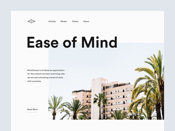
Focus
Draw your audience in by using white space around the focal point of your design. This will help to direct the eye and attract attention to the content. When used appropriately, white space can be an effective way to emphasise different elements and create a bigger impact. This will, in turn, help the audience to digest the information and keep their attention and create a better user experience.
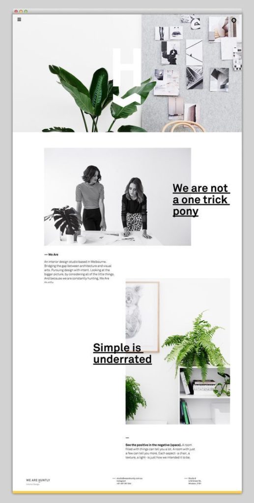
Layout
Simple designs don’t have to be boring. Creating an interesting piece of work without it being cluttered will only benefit the purpose you’re creating it for in the first place. Plain colours will help the audience to digest the information also, which is why many big-name brands tend to have a modern, simple layout and design.
Balance
Passive white space is a big reason why the type is understood easily. Helping to improve readability, using more white space will make your text easier to understand and creates a balance between type and graphics.
You can use white space in any way that benefits your design. Finding a great middle ground can be difficult; using too much could be perceived as boring and too little, cramped and difficult to read. Trial and error are part of the process and it’s a great way to experiment.
Play with your layout and spacings, ask somebody for feedback and see how white space can improve your graphic design skills.
If you’re looking to supplement your marketing efforts with effective design creation, get in touch with us today at Be My Social to see how we can help!