
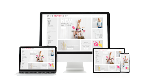
What is Responsive Web Design?
Responsive web design (RWD) is an approach to web design and development that aims to make web pages and applications render and function effectively on a variety of devices and screen sizes. The primary goal of responsive web design is to ensure that the user experience remains consistent and user-friendly, regardless of whether a website is accessed on a desktop computer, laptop, tablet, smartphone, or any other device with an internet connection.
Let’s explore some of the key terms related to responsive web design:
Responsive Design Basics:
- Website Design : Responsive web design is a service that’s particularly important for businesses in Doncaster and beyond, as it ensures their websites are accessible and user-friendly on all devices.
- Website Layout: The arrangement of elements on a web page, including the placement of text, images, and other content.
- Viewport: The visible area of a web page within the user’s browser window, which can vary in size depending on the device and screen
Media Queries:
- CSS Media Queries: CSS (Cascading Style Sheets) rules that allow web designers to apply styles and layout changes based on the characteristics of the device or viewport, such as screen width.
- Common Screen Sizes: Understanding the common screen sizes and resolutions helps designers create responsive layouts that accommodate a wide range of devices.
- Screen Size: The physical dimensions of a device’s screen, typically measured in inches or centimetres.
Different Screen Sizes:
- Large Screens: Devices like desktop computers and large monitors that have ample screen real estate.
- Small Screens: Devices like smartphones and small tablets with limited screen space.
- Touchscreen: Devices that allow users to interact with the screen directly, usually with their fingers.
Importance of Responsive Web Design:
Responsive web design is crucial because it ensures that your website’s layout and content adapt seamlessly to different screen sizes and devices. This adaptability enhances the user experience and can lead to increased engagement and conversions. In today’s digital landscape, where users access websites from a wide array of devices and browsers, responsive design is a fundamental aspect of creating a successful online presence.
In the next section, we’ll explore the significance of mobile devices in 2023 and how they relate to responsive web design.

The Significance of Mobile Devices in 2023:
In recent years, the significance of mobile devices in the digital landscape has grown exponentially. As we move further into 2023, it’s essential to understand the impact of mobile devices on web design and why responsive web design is more crucial than ever.
Mobile Traffic Statistics:
In today’s digital landscape, mobile devices, including smartphones and tablets, have fundamentally transformed the way people access and interact with the internet. Understanding the key statistics related to mobile traffic is essential for recognizing the importance of responsive web design in 2023.
Mobile-First Usage:
Mobile-First usage refers to the growing trend of users primarily accessing websites through their mobile devices. Here’s why this trend is significant:
- Dominant Platform: Mobile has emerged as the dominant platform for online engagement. Users are more likely to initiate their online journeys on a smartphone or tablet. This shift in behaviour underscores the need for websites to cater to the mobile audience first.
- On-the-Go Access: Mobile devices offer users the convenience of accessing information, services, and products while on the go. Whether it’s researching a product, checking social media, or finding local businesses, users rely heavily on their mobile devices for these tasks.
Mobile Search:
The way search engines rank websites has evolved to reflect the mobile-first landscape:
- Google’s Prioritization: Google, the world’s leading search engine, now prioritises mobile-friendly websites in its rankings. This means that websites optimised for mobile devices are more likely to appear higher in search results.
- Improved Discoverability: A mobile-friendly website is more discoverable on search engines. If your website isn’t optimised for mobile, it may suffer in terms of search engine visibility, potentially impacting your online presence and customer acquisition.
Rise of Smartphones and Tablets:
The proliferation of smartphones and tablets in recent years has brought about a significant shift in how users engage with digital content and services. This shift has far-reaching consequences for web design and user expectations.
Always-On Connectivity:
Smartphones, in particular, have become an integral part of modern life due to their always-on connectivity:
- 24/7 Accessibility: Smartphones keep users connected to the internet around the clock. This means that your website can be accessed at any time, from virtually anywhere, enhancing the potential for user engagement.
- On-the-Go Information: Users rely on their smartphones for on-the-go information retrieval. Whether it’s checking the news, looking up directions, or making last-minute purchases, smartphones are the go-to devices for quick access to information and services.
Multitasking:
Another notable aspect of the rise of smartphones and tablets is the prevalence of multitasking among users:
- Device Switching: Users seamlessly switch between devices throughout the day. They might start a task on their smartphone during their commute, continue it on a tablet at work, and finish it on a desktop computer at home. This dynamic behaviour requires websites to provide a consistent experience across devices.
- Consistency Matters: Users expect a consistent experience regardless of the device they’re using. Inconsistent layouts or functionality can lead to frustration and may result in users abandoning a website in favour of a more user-friendly alternative.
Google’s Mobile-First Indexing:
- Search engines like Google now prioritise mobile versions of websites when indexing and ranking:
- Mobile-First Indexing: Google primarily uses the mobile version of a site’s content for ranking and indexing, making mobile optimization essential for SEO.
- Improved Rankings: Mobile-friendly sites are more likely to rank higher in search engine results pages (SERPs), increasing your site’s visibility.
The Need for Responsive Web Design:
- Given the increasing prevalence of mobile devices, your website must cater to a diverse range of screens and devices. This is where responsive web design comes into play:
- Enhanced User Experience: Responsive websites provide a seamless and enjoyable experience for users, regardless of their device.
- Improved SEO and Rankings: Responsive design aligns with Google’s mobile-first indexing, positively affecting your site’s search engine rankings.
- Cost-Effective Maintenance: Maintaining a single responsive website is more cost-effective than managing separate desktop and mobile sites.
- Higher Conversion Rates: An optimised mobile experience can lead to higher conversion rates, increasing your website’s effectiveness.
In 2023, the significance of mobile devices in shaping online experiences cannot be overstated. Responsive web design isn’t merely a trend; it’s a necessity to ensure your website remains competitive, accessible, and user-friendly in an increasingly mobile-centric digital landscape.
In the next section, we’ll delve into the specific benefits of responsive web design and why businesses in Doncaster and beyond should prioritise it for their online success.

Benefits of Responsive Web Design in 2023:
Responsive web design offers a multitude of advantages, ensuring that your website remains competitive, accessible, and visually appealing across various devices, browsers, and screen sizes.
One of the primary benefits is an enhanced user experience. Responsive design prioritises the user’s comfort and convenience by adapting the website’s layout and content to different screen sizes and devices. This approach aligns with the fundamentals of great web design, providing a consistent and user-friendly experience regardless of how visitors access your site.
Moreover, responsive design plays a pivotal role in improving your website’s search engine optimization (SEO) and rankings. It caters to different browsers, ensuring compatibility and increasing your website’s reach. Sites optimised for various screen resolutions, including high-definition displays, tend to fare better in search engine rankings. By adapting to different screen dimensions and enhancing compatibility with popular browsers like Google Chrome, responsive design can positively influence your site’s online visibility.
Cost-effective maintenance is another compelling advantage. In places like Doncaster and beyond, businesses benefit from responsive design by eliminating the need to maintain separate desktop and mobile websites. Whether you’re launching a new site or seeking to revamp an existing one, adopting responsive architecture from the start simplifies maintenance and updates, reducing long-term costs. Leveraging professional website design services ensures that your site remains responsive and cost-effective over time.
Finally, responsive web design contributes to higher conversion rates. Your customers’ success hinges on a seamless shopping or browsing experience, especially on mobile devices where browsing continues to grow. By catering to mobile browsers and embracing responsive design, your website can facilitate higher conversion rates, ultimately driving your online success in 2023.

Key Principles of Responsive Web Design:
Responsive web design relies on several core principles and techniques to ensure that websites adapt seamlessly to various devices and screen sizes. Here are the key principles:
Fluid Grid Layouts:
One of the foundational principles of responsive design is the use of fluid grid layouts. Instead of fixed-width layouts, responsive websites use grids that automatically adjust based on the screen size. This flexibility allows content to reflow and rearrange itself, ensuring that the design looks good on screens of all dimensions.
Flexible Images and Media:
Responsive design incorporates flexible images and media that scale proportionally with the screen size. This prevents images from being too large on small screens or too small on large screens. Techniques like CSS max-width: 100% ensure that images adapt gracefully.
Media Queries for Different Screen Sizes:
Media queries are CSS rules that allow designers to apply styles based on various conditions, such as screen width, height, and device orientation. By using media queries, web developers can customise the layout and design for different screen sizes and orientations.
Consideration of Touchscreens:
With the prevalence of touchscreen devices, responsive design takes into account the unique interaction methods of touchscreens. This includes optimising button sizes and touch targets to ensure a smooth user experience on smartphones and tablets.
Consistency of Content:
Responsive web design emphasises the consistency of content across devices. While the layout may change, the core content should remain accessible and provide a coherent user experience. This consistency is essential for maintaining branding and user trust.
Performance Optimization:
Performance is a critical aspect of responsive design. As websites need to load quickly on a variety of devices and network conditions, optimising images, scripts, and other assets is a key consideration. Techniques like lazy loading and minification help improve performance.
Testing Across Devices and Browsers
Thorough testing across devices and browsers is crucial to ensure that a responsive website functions correctly everywhere. This involves testing on various devices, screen sizes, and browsers to identify and address any issues.
Progressive Enhancement:
Progressive enhancement is a philosophy that starts with a basic, functional version of a website and then adds enhancements for more capable devices. This approach ensures that even users with older or less capable devices can access and use the site effectively.
Accessibility:
Responsive design should prioritise accessibility to ensure that all users, including those with disabilities, can navigate and interact with the site comfortably. This includes providing alternative text for images, keyboard navigation support, and semantic HTML.
How Be My Social Can Help:
At Be My Social, we understand the critical role responsive web design plays in establishing a strong online presence and ensuring your website’s success in 2023 and beyond. Our experienced team of web designers and developers is dedicated to helping you harness the power of responsive design to its fullest potential.
When you partner with Be My Social, you gain access to a wealth of expertise in website design and development. Our professionals are well-versed in the key principles of responsive web design, from fluid grid layouts to media queries and performance optimization. We bring these principles to life in every project we undertake, ensuring that your website not only looks stunning but also functions flawlessly on a diverse range of devices and screen sizes.
We recognize that responsive design is not a one-size-fits-all solution. Every business is unique, and your website should reflect your brand identity and cater to the specific needs of your audience. That’s why our approach to responsive design is tailored to your business. We take the time to understand your goals, target audience, and industry trends to create a customised responsive architecture that aligns perfectly with your objectives.
Whether you’re launching a new website or seeking to enhance the responsiveness of your existing site, Be My Social is your trusted partner. Our commitment to excellence and attention to detail ensures that your website will not only meet the highest standards of performance and usability but also align with the latest trends in web design.
Moreover, our comprehensive testing procedures leave no stone unturned. We rigorously test your website across various devices, browsers, and screen sizes to identify and rectify any issues, guaranteeing a seamless and consistent user experience for your visitors.
By choosing Be My Social as your website design agency, you’re investing in a responsive web design strategy that’s poised to drive your online success. We’re here to make sure your website stands out in Doncaster and beyond, capturing the attention of your target audience and converting visitors into loyal customers.
Conclusion:
In the dynamic digital landscape of 2023, responsive web design isn’t just a trend; it’s a necessity. The significance of mobile devices, the prevalence of diverse screen sizes, and the ever-evolving browser ecosystem have made responsive design an essential component of online success. It’s a strategic choice that enhances the user experience, improves search engine rankings, reduces maintenance costs, and ultimately leads to higher conversion rates.
As businesses in Doncaster and beyond seek to thrive in this mobile-centric era, embracing responsive web design becomes paramount. It’s not merely about making your website look good on different devices; it’s about ensuring your website’s accessibility, usability, and effectiveness across the entire spectrum of screens and platforms.
Ready to unlock the full potential of responsive web design for your online presence? Be My Social is here to help. Our team of experienced web designers and developers specialises in creating responsive websites tailored to your unique needs and objectives. Whether you’re launching a new site, revamping an existing one, or simply looking to enhance its responsiveness, we have the expertise to make it happen.
Don’t miss out on the opportunities that responsive web design can offer in 2023. Contact Be My Social today to discuss your web design needs, and let us take your online presence to the next level.